Tuesday, November 29, 2011

Mar-Lane Motel

The Mar-Lane began life as a “Hotel Court”. This style of lodging was the precursor to the Motel form we most commonly associate with the word. Court-style Motels typically were one-level structures, with a common area between the units for guests to share. These had grass, tables, chairs, etc. While it has quite a different feeling to the pool area and decks that most of our Motels have in The Wildwoods, the aquatic equivalents seem to be the evolution of these “courts”. The current, more typically Motel-like form the Mar-Lane has had since the late 1950's is said to have been built from the original “Hotel Court” building, but it’s a little hard for me to picture this transformation. The original one-story, pitch-roofed Court, had a U-shape to the structure housing all the units that were around the property perimeter. The Motel has all its units in a two-floor, flat-roof, L-shaped building. Its attached 2nd floor deck extends this to a reverse J-shape. For the Motel to have been built from the Court, a piece of the U-shaped structure would have to have been removed. If so, I’d guess the section removed would be at the property’s southern end, to free up space for parking. Not to mention the building in the center of the Court, to make way for the pool.

(The Mar-Lane in its early "court" form, as depicted on a post card of the period. Image taken from a card previously for sale via Card Cow - please visit their site for vintage post cards and other items at http://www.cardcow.com/):


The Mar-Lane is centrally located in beautiful downtown Wildwood, at Montgomery and Atlantic Avenues. Whether this is a “good” location or not is somewhat dependent on what one is looking for in a stay in The Wildwoods. If you’re one to visit the Boardwalk every chance you get, but doesn’t necessary need to see it all the time, and/or you like to be amongst the “action” of Center City Wildwood, it’s a great location. If you’re one to visit the beach every day, would at least like some sort of view of it from your Motel, and want a little more peace - especially at night, etc. - it might not be.

(A picture of the Mar-Lane's vintage motel era neon roadside sign. Image courtesy of Dr. Andrew Wood/San Jose State University - please visit his Motel Americana part of the SJSU site at http://www.sjsu.edu/faculty/wooda/motel/):


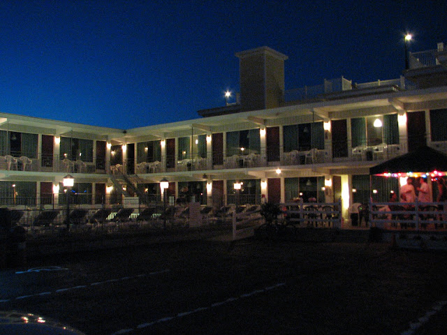
As noted above in the comparison to its “Court” era, the Mar-Lane is a two-floor Motel, and is L-shaped along the structure housing its rooms. I believe it has approximately 27 units, which spread across both floors - some of them face south to Montgomery, and the rest east to Atlantic. The main structure is painted white, with the doors in a deep burgundy. These colors somewhat recall the Mar-Lane’s Court era, which had its walls in white, and its roof in a deep, somewhat blood red. Windows to the units are appx 2/3 view from the top down, with light green backed curtains. Lamps styled like lanterns are posted up high between each unit. Railings across the balcony, down the middle of the “L” staircase, and across the ground level outer perimeter. These appear to be vintage Mid-Century. They are of an interesting style that has a bunch of 90 degree angled twists and turns, with small, square flat centered portions (the - now demolished - Sans Souci of North Wildwood has similar railings, as does Knolls in Wildwood proper, thankfully still with us). Nondescript white resin chairs are placed outside the units. A sundeck extends east from the Motel’s southwest end, and is accessible from the 2nd floor balcony. The deck doesn’t seem to be connected to the pool area. Railings around the deck and pool area are metal, but plainer than the others, and consist of vertical bars. These railings plus the sundeck were added sometime after the Mar-Lane evolved from a court to a motel. In the earlier period of the Mar-Lane's motel era, the pool area had no railings at all. The addition of the deck somewhat obscures one of the motel's architectural features - the southwest corner room on the 2nd floor “floats”, without a 1st floor unit below it. It is not a “no means of visible support” styled unit like the corner room in a similar position at the Eden Roc (it has a visible support pole to the ground), but still helps gives that corner, and the Motel overall, a little more distinction.

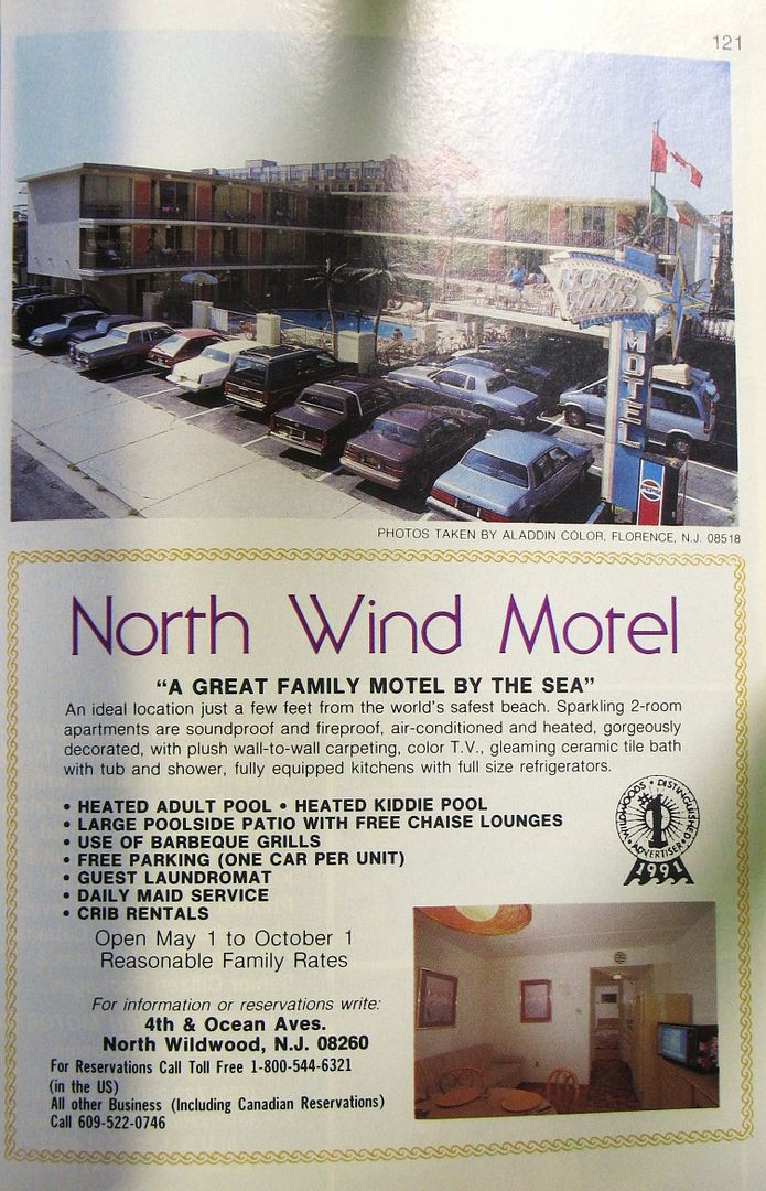
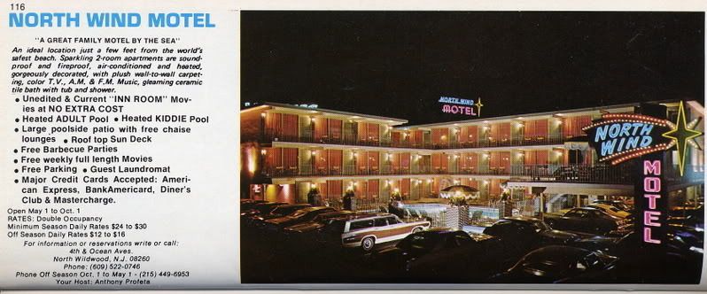
(From a 1959 Wildwood motel guide, posted by Al Alven on the Doo Wop Preservation League's Message Board - thread linked near the bottom of this post):


The pool area is in the middle of the “L”. The pool itself is rectangular, with rounded corners, tile around the top of its walls, and a fenced off shallow portion for small children, using even newer railings for it than elsewhere around the area. White chairs - angled, with a fan-shaped back - are around the pool, as are canvas loungers with white & green striped fabric. These coordinate with the other colors on the Motel quite well. More lantern styled lamps are used around the pool and deck, though on posts. White flagcrete is below the outer perimeter railings, making a nice border to the parking area. Towards the northeast corner, a section in front of the 1st floor units was extended to form a patio-like area, with a steps and a ramp to help with accessibility. It has railings that are more countrified than what's used through the rest of the grounds, and appear to be resin. In the same area, closer to the sidewalk, is a structure with a more house-like appearance than the main part of the Motel, and includes the use of shutters. A portion of this building is 3 stories, with a 1-story portion on the east end of it. This area contains the office and, considering its height, possibly more (of which I can’t confirm). The same white/burgundy used on the Motel continues here. Adjacent to this, street-side near the main Motel building - and continuing the countrified look of the newer changes/additions - is some more “public” space, used for tables/chairs and the barbecues available for guest use. At the southeast corner is a wooden roadside sign, with tall green posts, and tan/burgundy/green artwork. The sign says MarLane Lodging (rooms chambers), lit by more lantern style lights. A weathervane sits above it all, topped by a fish!

(A 2007 image of the Mar-Lane's exterior at dusk's end, taken by Stephen Lyford - https://plus.google.com/photos/111669230439166315259/albums):


With this use of a few different styles, the Mar-Lane’s look ends up being a bit of a mix – some genuine “Doo Wop”, other things with a more traditional residential house look, some items with a country feel, etc. The residential/country styled features/details do not have any Mid-Century character to match the motel itself, and gives me mixed feelings about the overall appearance of the motel. When I look at parts of Mar-Lane, like its oldest railings, I see things to admire from a “Doo Wop” perspective. Then I look at other portions of it, and get the impression of a place that’s tried to get away from roots. At the same time, given it’s “Court” origins, the Mar-Lane got away from its real roots a long time ago. Perhaps the "house" portion is a nod to it's "Court" years. While most of its “country” touches do not give the feel of a potential new Doo-Wop “style” (Phonee Colonee, Tiki, etc.), they mostly aren’t executed in a sterile way, so the Mar-Lane overall still has charm. It is nice to see (what I'm guessing is) the owners' tastes reflected in their motel. However, it'd be great if they could work out a way of keeping their love of that aesthetic going there, and also make it fit a bit better within Mid Century/Doo Wop - both to fit with Wildwood's history of the era, and the main look of the motel itself. The Saratoga does it within the Colonial style, though it has the advantage of being built with that theme to begin with in 1960. The Carriage Stop used to have neon in its rooftop sign, and that sign's look (for example) balanced having Colonial and "Doo Wop" together pretty well. Perhaps in the future, this type of merging of styles will be a possibility at the Mar-Lane.


To see past discussion on the Mar-Lane, and if you wish to contribute further to it, please visit the thread linked below from the Doo Wop Preservation League's Message Board:

http://www.doowopusa.org/cgi-bin/yabb2/YaBB.pl?num=1280721625


Comments are also welcome on our Facebook wall:

https://www.facebook.com/pages/Wildwood-Motels-Yesterday-Today-Forever/238199252907548

Friday, November 25, 2011

The Pan American at night

I took this picture of the Pan American's south side on September 26, 2009. A more thorough post detailing this hotel will be made in the future, but for now enjoy the view:


A belated Happy Thanksgiving to all who celebrate.

Wednesday, November 23, 2011

North Wind Motel

The North Wind Motel is one of the older Motels in this most northern section of our island. It is a classic Mid Century low-rise Motel. Its structure housing its units is L-shaped. It originally had approximately 33 units. With the room layouts noted on the Motel's official site, I get the impression some units are now combined to provide larger accommodations.

(The North Wind's listing from the 1991 Greater Wildwoods Hotel Motel Visitors Guide, photos by Aladdin Color):


The North Wind is located on the Southeast corner of 4th and Ocean Avenues, and is about a block or so from the beach/ocean, with JFK Blvd. to cross. It is a 3 floor masonry structure painted white, with a bit of darker brick trim between the units, floor to ceiling glass, and wooden louvered outer doors, also in white. Individual, white lights for each unit are at about 3/4 height. Amazingly, it has what appears to be its original, aluminum railings along the balconies, the sundeck, and some of the pool area. Great to see... Units stretch across its 2nd & 3rd floors. The ground floor is home to the lobby/office with an blue canopied entrance, and more units. Level two has a sundeck that breaks from the L-shape, and on the Northwestern portion of the property. Some parking spaces are located partially under the deck. The irregular-shaped pool area appears to be recently redone, but based on the original design. A relatively newer, backlit roadside sign, is on the property's Northwestern corner. Its vacancy indicator is in neon. Wildwood Palms dot the pool area and sundeck.

(The 1975 GWHM Accommodations Directory listing for the North Wind. Scan courtesy of Claudia Metcalfe - http://i104.photobucket.com/albums/m193/claudiam1962/Wildwood%20Directory/Motels%20M-N-O/NorthWind.jpg)::


The North Wind has an overall has a neat, clean look. A re-creation of either of the original neons, whether the rooftop or the amazing roadside sign, would be a great addition however.


To see past discussion on the North Wind, and if you wish to contribute further to it, please visit the thread linked below from the Doo Wop Preservation League's Message Board:

http://www.doowopusa.org/cgi-bin/yabb2/YaBB.pl?num=1265172557

Friday, November 18, 2011

Saratoga Inn


The Saratoga Inn is probably the best example of “Phony Colonee” (as its come to be known) Doo Wop Architecture ever built on our island. It doesn’t just use a name as the basis of a loosely defined theme, or only contain a few flourishes and details to give it some Colonial/Early American feel. Instead, the Saratoga looks like a large house built in the style, as much as can be for a Motel, without much compromise. I can remember that when I was younger, I wasn’t too interested in staying there because, while I liked the Motel itself, at the time I thought it might not give off the feel of being in Wildwood enough (if that makes any sense). I’ve since come around and realized that the strength in its execution of the theme is what makes it a standout, in look, feel, and the overall experience. This also ties in with the aesthetic of the motel not just providing a nice place to stay, but making you feel like you're somewhere, just by being at the motel itself. If you’re at the Saratoga, you get the chance to encounter what a Wildwood Mid Century Motel would be like if it could have somehow originally been designed and built much earlier in time.


The Saratoga Inn was built in 1960, and therefore celebrated a 50th Anniversary recently. It is located on the Northeast corner of Farragut Road & Ocean Avenue. It is not directly on the beach, but one just needs to walk past the Bal Harbor, with no streets to cross to get there. It is a two floor L-shaped structure, covered in red/brown/tan brickface. It features a pitched roof with a cupola on each part of the “L”. The cupolas were not an original design feature, but fit in so well that they look like they could have been. I believe the main sign is original – “Saratoga” placed centered above “Inn” – and is made of individual solid white letters that protrude from the building. It is positioned on the wall by the deck above the office. Two relatively small green and gold “Saratoga Inn” rectangular signs are on the walls, one to each side, near the lobby. These two signs are much newer than the Motel, but fit in pretty well, even if they're a bit redundant.

(The Saratoga's listing from the 1995 Greater Wildwoods Hotel Motel Visitors Guide, including an image of the vintage lobby decor):


Units are located on both levels along both inner sections of the “L” facing South & West (and the pool), on the outer part of one section of the “L” facing North, and one oceanview unit on the Southern end cap of the “L”. The restaurant/coffee shop is located below that unit. The lobby/office is at the base of the Westernmost point, with a deck above it that is formed as a continuation of the balcony for the units. A traditional white double doorway with long black hinges and divided glass on the doors serves as the entrance to the lobby, and is flanked by two bow windows with divided panes to its sides. Benches & planters are next to the entrance, and a date stone noting the year the Saratoga was built sits in the wall. Red brick pavers are used for the pathway here and by the first floor units. There are approximately 38 units in total.

The rooms have white louvered outer doors with long black hinges, white trimmed, divided pane windows with white shutters. Lantern style lights with black frames and clear glass are positioned high by the doors. Railings are white, plain but neat and compliment the overall look well. They appear to be relatively new, but don’t seem to stray too far from the style of the originals. Support posts double as decorative items. Stairs are provided in the middle of the “L” and midway across the North side. A section of the balcony/railing towards the Southern end juts out to form an additional deck, which overlooks the pool area. The pool and its surroundings are in the middle of the “L”. The pool area is fenced in from the parking area with a low rise wall, clad in matching brick-face, with a small bit of fencing atop. Except for a few spaces parallel to the lobby, parking is available along the perimeter of all units, which follows the tradition of a Motel allowing you to park your car and be able to see it from your room.

Overall, a very distinctive motel, which especially considering The Wildwoods' renowned collection of Mid-Century Modern architecture, is particularly impressive.

Wednesday, November 16, 2011

A View of the Strip

I use this image as the profile picture for this Blog's Facebook page. This was taken from the upper level of the Caribbean Motel on June 8, 2007, looking south down the Crest's Ocean Avenue strip:


Notice the canted glass wall of windows, one of the many interesting architectural features of the Caribbean. These are used to supply views to the "Cabana Lounge", and two units in the motel, mostly their premium "Room 229". Below is a view from inside 229 looking out, taken a day after the picture above:

Tuesday, November 15, 2011

Aquarius Motel


The Aquarius Motel was built around 1970. Greek themed/named/influenced businesses seemed to be growing by then in The Wildwoods. Why not another? This time a then new Motel chose a Greek name that goes a little further to fitting “Wildwood By the Sea” by having it water themed. Aquarius the Water Bearer, as noted above, is a water constellation. The Aquarius' roadside sign, in its original state, showed this. Another possible influence on the name was the pop culture prominence of the “Age of Aquarius” in the few years leading up to the Motel’s opening, and the song “Aquarius” making up part of a big hit for The 5th Dimension in 1969. Considering this, I’d be surprised if the Motel’s name wasn’t at least a little bit influenced by this part of the culture of those times as well. It was not uncommon for Motels in Wildwood to adopt their names/themes from cultural influence. However, from the few vintage images of the Motel that I’ve seen, there didn’t seem to be much in the way of theme related to its name carried out at the Motel in its early days beyond the sign.

The Aquarius has an excellent location at Taylor and Ocean Avenues, one block north of Rio Grande Avenue (a main entrance/exit point on the island). It has a lot of exposure and is near the Convention Center. One of the Motel’s early selling points was its proximity to the new for 1971 (now demolished) “Convention Hall”, which was at Burk & Ocean Aves. With the opening of the current Convention Center in the last decade, the Aquarius has ended up being even closer to it than it was to the old facility.

The Aquarius is a four-floor masonry structure. It is aligned straight from north to south, and all of its 27 units face oceanfront, a not too common layout in The Wildwoods. 8 units stretch across each of the 2nd to 4th levels, with the remaining 3 units at ground level. The units behind the slightly north of center elevator tower seem to have partially obscured views, but I can’t confirm to what extent they are. Each unit has solid entrance/exit doors that were painted an aqua/turquoise blue during exterior renovations performed in 2010 (these doors were previously dark green). Two chairs are provided outside each unit. Globe shaped lamps sit slightly below ceiling height to light the exteriors of the units. A sandy colored tan brick face is used as a small divider between units, and extensively elsewhere around the property – covering the elevator tower, large dividers in the deck railings, etc. Plain, but attractive metal railings with fairly narrow straight vertical bars shield the balconies and deck. These are also used around the centrally located pool area on the ground level. The deck is at the southeastern corner of the property on the second level - it is accessible by the balcony there, and also an east-west staircase located towards the southern end of the pool area. Diagonal staircases near the deck also connect the floors 2-3, and 3-4. They sit by the second room (from the south) on both the 2nd and 3rd floors. The office is south of the elevator tower on the ground floor, overlooking the pool area. Parking spaces are provided along the southern (Taylor Ave.) and eastern (Ocean Ave.) property edges – the Ocean Ave. spaces are totally open air, and the Taylor Ave. ones are covered at the top by the sundeck and (as you move further west) by the Motel itself as the southernmost section of the Motel is suspended.

Special mention needs to be given to the Aquarius’ roadside sign. It is a very tall, vertically oriented sign. It has a U-shaped center with different colored relatively small stars along the U, and short extensions to the east that connect individual aqua and white backlit panels to it – one for each letter of the name AQUARIUS. Up until a few years ago, supports to the west between the I&U and 1/2 of the S held a neon water bearer, in red, white, blue, and yellow/gold. It was a very cool feature that I hope is saved and maybe put back in use one day. I actually find the sign – not even counting the removed neon section – to have more of Mid Century look/style than the actual Motel itself. The Motel almost seems like the beginnings of the transition between the styles often used on small to medium sized Mid Century Motels, and the comparatively plainer hotels/motels to follow. As detailed above, many of the classic architectural features are still here in basic form, but the look is relatively conservative. Still, a neat looking, clean design that fits well with the earlier Motels in The Wildwoods, unlike most all of the "multi-family" of the development on the island in the 2000’s.


To see past discussion on the Aquarius, and if you wish to contribute further to it, please visit the thread linked below from the Doo Wop Preservation League's Message Board:

http://www.doowopusa.org/cgi-bin/yabb2/YaBB.pl?num=1298357622

Sunday, November 13, 2011

Image of the Park Lane

Sometime in the future, a proper write-up/feature will be posted on the Park Lane Motel. For now, enjoy this picture taken on September 26, 2009:


If you look closely (through the deck's railing), you'll see the Yankee Clipper's rooftop neon sign in the distance.

Friday, November 11, 2011

Matador Motel

The Matador is one of the later day Mid Century styled Motels built on the island – it opened in 1970, recently celebrating its 40th Anniversary. Its name seems to carry over less in theme throughout and more in the colors and other appearance touches, like the style of the signs, etc. It has an interesting location – “16th Avenue and the Beach”. Unlike the Crest, very few Motels in North Wildwood sit this close to the beach. This also places it at the very Northern end of the Boardwalk. So, if you want a place to stay in North Wildwood, be close to the beach, near to the Boardwalk but away from its noise and crowds, the Matador seems to be a really good choice.

The Matador is a four-floor Motel, and is T-shaped in its main sections housing the rooms. It has what I call a west wing, which is placed north-south, and an east wing, which is laid out east-west. It has units located on all four levels of the west wing (though the 1st floor only has units in its southern portion, near the pool and office), and more units on the 2nd & 3rd levels of the east wing. There are appx. 55 units in the Motel, with numerous unit types available. An elevator is located where the two wings connect. A large deck covers the 4th floor of the east wing, accessible where the two portions meet. An additional, relatively smaller (but still sizeable) 2nd level deck is at the southeast end off the property, and is accessible from stairs leading from the ground, and also between the 2nd & 3rd floors of the east wing. This deck ends up giving the entire Motel complex a lowercase h-shape. The 4th floor seems to have been added sometime in the ‘80’s. I’m guessing the long deck at that level was added at the same time, or not long after. The 2nd floor deck is an original feature.

Red, in keeping with the name, is used prominently to fine effect – on the doors, the balcony edges, and all signage/logos/etc. In the past, red louvered outer doors were used – not sure when these were removed. Off white brick-face trims the space between units, end sections of the wings, and surrounds the railing dividers around the pool and decks. It is also used to trim the exterior staircases that are at both the north and south ends, which jut out perpendicularly. These staircases also seem to have been added at the time of the 4th floor addition. These replaced stairs that used to cross more closely and parallel to middle units in each section of the north-south wing. They each have a downward sloping red/white “roof”, a nice touch to help shield the stairs. Simple, white, flush mount lights sit between each unit. Lamps by the decks, etc., sit atop black posts and perches, and the floor to ceiling glass outside the units is also trimmed in black. Railings used by the unit’s balconies are curved vertical bars in white, and use the original design. When the Matador was expanded, they seem to have duplicated the existing ones to match. This style of railings are also used on the decks, though a portion of the 4th floor one has an area which uses newer white resin looking ones that are more of a solid surface – not sure why this is, other than to possibly shield off something from view. The pool area uses newer railings with straight, white vertical bars, which have a more open horizontal extended section at the top.

The pool area is located in between the southern end of the two wings and the 2nd floor deck. It’s mostly rectangular shaped, with rounded sections at the two “heads” – one looks like a kiddie pool, and the other is a raised hot tub with blue tile around its outer area. More of the blue tile decorates the inner edges of the pool and hot tub. An “M” Matador logo is in the pool’s bottom, in red. A mural depicting the beach/ocean and a rowboat is painted on the 1st floor wall of the east-west wing that faces the pool area. The boat is particularly appropriate with the North Wildwood Lifeguard building on the beach near the Matador, and their use of the Matador’s lot to store equipment in the off-season. Earthy/sandy colored tile surrounds the pool area, with real palms used, planted in pots. Red and white vinyl strap chairs (my favorite type) are used throughout the exterior – lounges by the pool, armchairs by the rooms, and both are used on the decks.

As part of the renovations made before the 2010 season, the 4th floor deck’s surface was repaired and resurfaced with a (to my eye) sandy, but floor like finish. Balcony surfaces got similar treatment, but with more of a stone like look. Existing exhaust stacks on the 4th floor deck got coated/finished/built up and now serve as tables with granite tops and red pyramid shaped umbrellas. A driveway travels between the pool area and 2nd level deck to connect the north and south sides of the property.

Parking is mostly on the north side, including some spaces under cover, with a few spaces near the office and pool, and also by the driveway. A Townhouse sits next to southwest end of the Motel. This is not the same as the “Family Apartment”, which is off site. The Townhouse is a two floor, stucco clad structure, with a white base, and red trim. It also has red/white soft awnings, white vertical railings, and a red shingle roof! The lobby/office is at the southwestern end of the Motel, next to the pool area, and was renovated over this past off-season. A red/white/black colored, rounded awning covers the immediate area leading to the office’s entrance. A beautiful, new neon sign is above this area. It depicts a Matador with the “M” logo in his cape, OFFICE, and a (NO) VACANCY indicator. A red MATADOR neon sign sits rooftop at the southern end, facing west. This duplicates a solid, raised sign once placed against the south wall, which was lit from behind in red. Due to its design and layout, unlike most Motels in The Wildwoods, its back walls – one on each wing – are exposed. Back walls to a Motel are most always nothing special, and if you drive up to the Matador from 16th, your first view of it, aside from the neon, is not from its “good side”. Which is too bad, because it’s an interesting Motel that such a first look doesn’t do justice to. The owners seem to make the best of this situation by (as with the rest of the Motel) keeping a fresh, clean appearance on each “back wall”. On the east wing back wall, murals are painted – one replicating the rooftop neon design, but vertically and with “OCEANFRONT FAMILY RESORT” next to it, and the other replicating the look of the new Matador styled neon by the office.


To see past discussion on the Matador, and if you wish to contribute further to it, please visit the thread linked below from the Doo Wop Preservation League's Message Board:

http://www.doowopusa.org/cgi-bin/yabb2/YaBB.pl?num=1275674313

Wednesday, November 9, 2011

Royal Hawaiian Motel


The Royal Hawaiian is great example of a large “Doo Wop” building, and how well the Tiki variation of it can be expressed on such a structure. It is located at Orchid Road and Ocean Avenue on the beach in Wildwood Crest. It has two distinctive sections – the East and West wings.

The East was originally constructed in 1969, designed by Lou Morey. It originally had four floors, with the fifth likely added not long after. Units stretch across each level, and are accessed by common area/balcony from the front of each unit. The exterior walls are covered throughout in “lava rock”, to fine effect. Up until recently, louvered outer doors in peach/orange were used throughout, though these were removed before the 2010 season, leaving behind pale green doors. This new color looks pretty good, but the doors themselves, particularly due to their divided pane style glass, look a bit out of place aesthetically. All units feature stationary floor to ceiling glass. Round, white glass lights hang from the “ceiling” above each unit. Attractive, metal railings with mostly horizontal bars appear to be in a natural finish, complimented by "bamboo" support posts shooting through the floors. Before the 5th floor was added, these "bamboo" supports went above the roof. I believe all these features are original from ’69, which is great to see. Outer stairways are towards the Northeastern end, near the oceanfront units. The roof is accessible from these stairs, where a fenced in deck area is available.

The West was constructed in 1978, with Lou Morey brought in to design it as well. Interestingly, there isn’t any apparent attempt to duplicate the existing original section here. Such a choice can make for disaster, but it worked out well here, with the complex looking great as a whole, even if the East original section is relatively more attractive to my eye. The ground level here is open space for parking underneath the Motel. Floors two through five have units throughout. All units are accessed from a rear facing, common balcony, and have private balconies facing Orchid Road. The walls are white painted masonry, with a strip of lava trim between every other column of units, where the original looking white, round lamps sit. The private balconies have somewhat of a “box” appearance, with their solid masonry sidewalls, with only the forward facing section having metal railings. Outer stairways for the West wing are located at the Southwestern end (rear of West wing), and have an interesting appearance that makes me think of the Guggenheim in NYC, due to the look of its outer walls and curved ends. The Western wall faces Ocean Avenue and is finished in white painted masonry and liberal amounts of lava on each end. The upper half of the masonry portion has large, distinctive neon signs. The Motel’s name lights up in pink, with Royal written diagonally upward, and HAWAIIAN straight across. A neon palm tree is below. It is partially revised from the earlier design – HAWAIIAN is the same, though it was previously yellow. The script for Royal has changed. The palm was originally a tiki mask. Both the previous and current iterations of the signage are very attractive and distinctive.

A center section links the two wings, and also contains a restaurant. A two story round section on the ground houses the office, with its roof used as a sundeck that’s accessible from the third level. At the top, above the 5th floors, is the Royal Hawaiian’s most distinctive feature – a one story, flat topped round section. Some call it a saucer. It is used as the owners’ residence. If I owned the Royal Hawaiian, I’d do the same.

An attractive, irregular shaped pool travels from about halfway down the side of the East Wing, and partially in front of it. A faux Hawaiian Atoll is an original feature of the pool, and has Wildwood Palms towards its ends. The kiddie section has a fountain. A smaller pool is fenced off to the west, which may be a hot tub. Railings matching the ones used for the East Wing balconies border the pool area from the Motel and beachfront, with solid, masonry ones at the street side, with round, white lights here and there along its top. Additional parking spaces are laid out west of the main pool area across Orchid Road, and on the west end by Ocean Avenue. A rectangular, one story, pitch roof structure is a relatively newer addition, and houses conference and game rooms. It is located between the West Wing of the Motel and the street side parking there.


To see past discussion on the Royal Hawaiian, and if you wish to contribute further to it, please visit the thread linked below from the Doo Wop Preservation League's Message Board:

http://www.doowopusa.org/cgi-bin/yabb2/YaBB.pl?num=1267845300

Tuesday, November 8, 2011

Picture of Flamingo Terrace neon sign

Kindly provided by Mark Peyko on this blog's Facebook page:

http://www.facebook.com/markpeyko

Wednesday, November 2, 2011

Skylark Motel

The Skylark Motel is a two story, U-shaped Motel originally built in the mid-1950’s.  As with many other Motels on the island, “Resort” is included in its title, though thankfully the word Motel has been proudly retained as well.  Unlike many Motels originally built as two floors, it has remained so, instead of adding a third floor sometime after.  Without acquiring more property, it will likely stay that way in the future, to continue to provide sufficient parking for its guests.  The Skylark survived a December 2008 fire that was fairly serious and had some concerned about its future. It reopened late in the 2009 season, with the damaged areas rebuilt in between.  Further renovations may have taken place, whether during the rebuild or after the season finished, as the Skylark’s site boasts “Newly Renovated Rooms!”.  I believe the owners of the Brittany Motel, also located in Wildwood proper, own the Skylark.

The Skylark is located between Spicer & Spencer Avenues, along the East side of Atlantic Ave.  It has approximately 35 units spread fairly evenly across both floors.  A lobby/office is located at the Southern end of the Motel, with a sundeck above it.  The pool area borders this, which includes a few tables and chairs, and some Wildwood Palms.  Colors are almost equal parts warm purple, pink and white, which work well together here.   The vintage railings were a recent loss since the fire, but the current, less ornate replacements look good.  The change in railings also allowed the pool area fencing to match.  These previously didn't match, likely due to the pool not being an original feature of the Motel.  An arrow shaped, double-sided roadside sign is located about halfway down the length of the property, and points to the Motel.  It has Skylark Motel and (No) Vacancy in reddish neon, small clear incandescent bulbs which fire in motion, matching colors, and a painting of a Lark.  To my eye, it’s one of the more distinctive signs on the island and is a classic, like the Motel it’s part of.

To see past discussion on the Skylark, and if you wish to contribute further to it, please visit the thread linked below from the Doo Wop Preservation League's Message Board.:


http://www.doowopusa.org/cgi-bin/yabb2/YaBB.pl?num=1266791736