
The Aquarius Motel was built around 1970. Greek themed/named/influenced businesses seemed to be growing by then in The Wildwoods. Why not another? This time a then new Motel chose a Greek name that goes a little further to fitting “Wildwood By the Sea” by having it water themed. Aquarius the Water Bearer, as noted above, is a water constellation. The Aquarius' roadside sign, in its original state, showed this. Another possible influence on the name was the pop culture prominence of the “Age of Aquarius” in the few years leading up to the Motel’s opening, and the song “Aquarius” making up part of a big hit for The 5th Dimension in 1969. Considering this, I’d be surprised if the Motel’s name wasn’t at least a little bit influenced by this part of the culture of those times as well. It was not uncommon for Motels in Wildwood to adopt their names/themes from cultural influence. However, from the few vintage images of the Motel that I’ve seen, there didn’t seem to be much in the way of theme related to its name carried out at the Motel in its early days beyond the sign.
The Aquarius has an excellent location at Taylor and Ocean Avenues, one block north of Rio Grande Avenue (a main entrance/exit point on the island). It has a lot of exposure and is near the Convention Center. One of the Motel’s early selling points was its proximity to the new for 1971 (now demolished) “Convention Hall”, which was at Burk & Ocean Aves. With the opening of the current Convention Center in the last decade, the Aquarius has ended up being even closer to it than it was to the old facility.
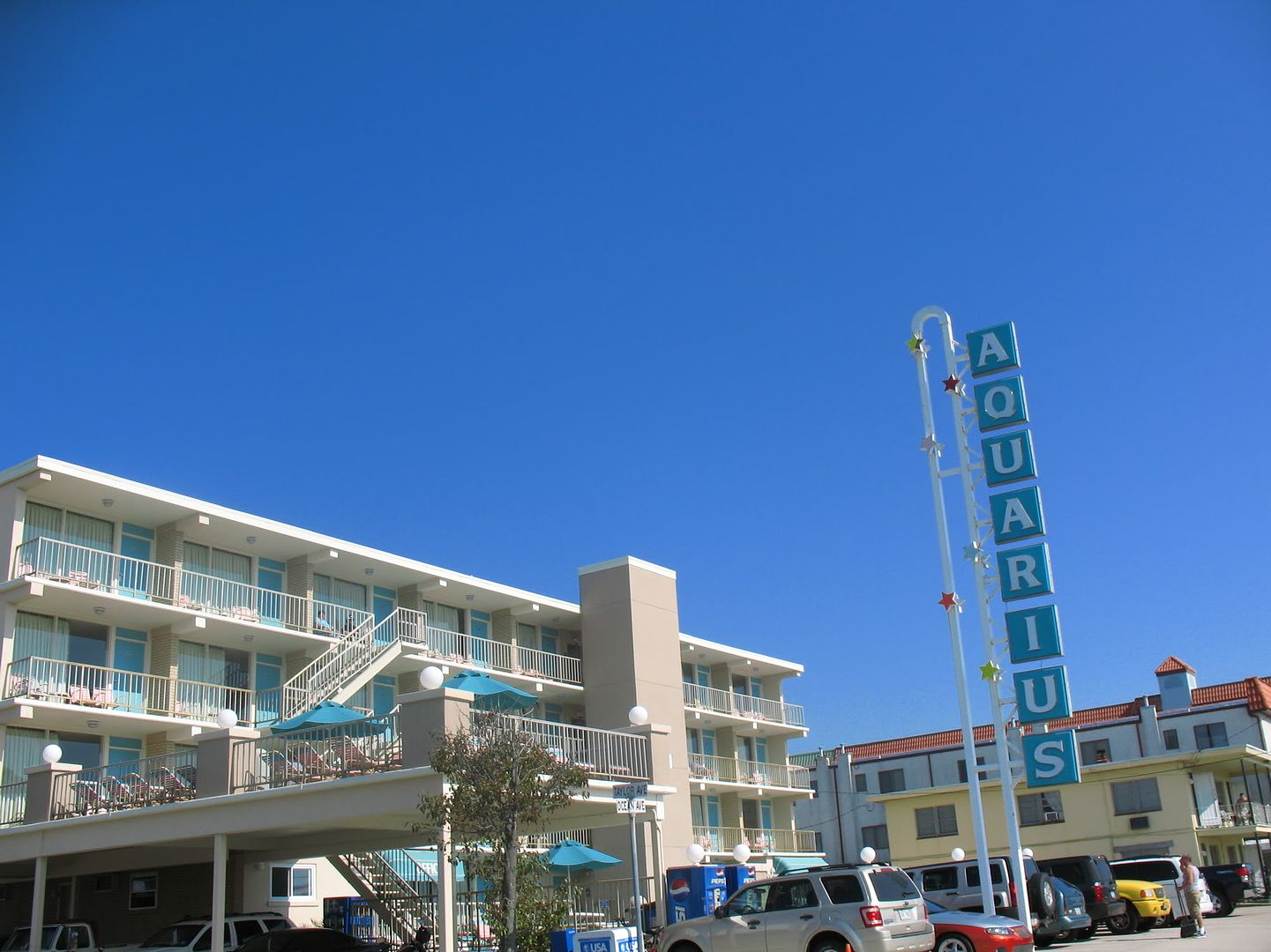
The Aquarius is a four-floor masonry structure. It is aligned straight from north to south, and all of its 27 units face oceanfront, a not too common layout in The Wildwoods. 8 units stretch across each of the 2nd to 4th levels, with the remaining 3 units at ground level. The units behind the slightly north of center elevator tower seem to have partially obscured views, but I can’t confirm to what extent they are. Each unit has solid entrance/exit doors that were painted an aqua/turquoise blue during exterior renovations performed in 2010 (these doors were previously dark green). Two chairs are provided outside each unit. Globe shaped lamps sit slightly below ceiling height to light the exteriors of the units. A sandy colored tan brick face is used as a small divider between units, and extensively elsewhere around the property – covering the elevator tower, large dividers in the deck railings, etc. Plain, but attractive metal railings with fairly narrow straight vertical bars shield the balconies and deck. These are also used around the centrally located pool area on the ground level. The deck is at the southeastern corner of the property on the second level - it is accessible by the balcony there, and also an east-west staircase located towards the southern end of the pool area. Diagonal staircases near the deck also connect the floors 2-3, and 3-4. They sit by the second room (from the south) on both the 2nd and 3rd floors. The office is south of the elevator tower on the ground floor, overlooking the pool area. Parking spaces are provided along the southern (Taylor Ave.) and eastern (Ocean Ave.) property edges – the Ocean Ave. spaces are totally open air, and the Taylor Ave. ones are covered at the top by the sundeck and (as you move further west) by the Motel itself as the southernmost section of the Motel is suspended.
Special mention needs to be given to the Aquarius’ roadside sign. It is a very tall, vertically oriented sign. It has a U-shaped center with different colored relatively small stars along the U, and short extensions to the east that connect individual aqua and white backlit panels to it – one for each letter of the name AQUARIUS. Up until a few years ago, supports to the west between the I&U and 1/2 of the S held a neon water bearer, in red, white, blue, and yellow/gold. It was a very cool feature that I hope is saved and maybe put back in use one day. I actually find the sign – not even counting the removed neon section – to have more of Mid Century look/style than the actual Motel itself. The Motel almost seems like the beginnings of the transition between the styles often used on small to medium sized Mid Century Motels, and the comparatively plainer hotels/motels to follow. As detailed above, many of the classic architectural features are still here in basic form, but the look is relatively conservative. Still, a neat looking, clean design that fits well with the earlier Motels in The Wildwoods, unlike most all of the "multi-family" of the development on the island in the 2000’s.
To see past discussion on the Aquarius, and if you wish to contribute further to it, please visit the thread linked below from the Doo Wop Preservation League's Message Board:
http://www.doowopusa.org/cgi-bin/yabb2/YaBB.pl?num=1298357622
No comments:
Post a Comment